I hope you enjoy my blog for my media coursework. I have added links to thigns that have inspired my magazine and helped me develop my skills and creativity. All my posts are also all labelled to help navigating around easier.
Thank You!
Hannah

Tuesday, 10 May 2011
Wednesday, 23 March 2011


Tuesday, 22 March 2011
Evaluation Activity 3
What kind of media institution might distribute your media product and why?

I initially considered the well-known ICP media to distribute my magazine, but as they have over 60 magazine’s under their influence already, they had no gap in their market for Amplified and had a few similar genres and target audiences as my magazine- so would be unlikely to take on another similar one that may reduce the sale of their current magazines. I think a media institution like Development Hell Ltd would be a appropriate for my magazine, firstly due to it being an independent company who are focused on magazines that are varied in genre of music they present. They already publish two monthly magazines ‘Word’ and ‘MixMag’, the first of which that targets music and entertainment in general and the second targeting the clubbing scene. As my magazine is also an all-round music magazine but slightly swaying towards the new and upcoming artists, then the company has a gap in their market perfect for ‘Amplified’. Also on their team is former editor for Smash Hits! And Q so there experience in magazines for non-specific genres is large and would be helpful in launching my magazine to their already budding audience. The company also own DontStayIn.com, which is the world’s biggest clubbing social network site aimed at teenagers- the same target audience for my magazine so the advertising through their other franchises can be relayed to Amplified itself while targeting their exact audience. The Guardian Media Group, a bigger and well-known company, also has shares in Development Hell Ltd so will help branch out and advertise the magazine on a larger and more varied audience.
Evaluation Activity 5
How did you attract/address your audience?
Click on the photos to go to tags.


Through my audience questionnaire I found out quite a lot about what would attract my particular audience. Many said that simplicity on the cover helped it look grown-up and not childish which they liked; but also enjoyed the different bright colours making it still look fun and interesting and not dull and boring. The choice of pictures came up regularly as well, as they felt the black and white made it look sophisticated and cool, but with a dash of fun personality through the other pictures as well- making it relateable and therefore attracting their attention. The hand written fonts were came to come across well as they made the pages look less structured but while still working woth the rest of the page. They also added a 'personal' touch and 'creative flair' to the magazine overall.
Evaluation Activity 6
6. What have you learnt about technologies from the process of constructing this product?


For my pictures for the magazine I used a Canon D450 and a studio lighting umbrella to make sure my photos were of the best quality and looked professional. I found correct lighting was the most important in taking a photo- but if light was scarce playing with exposure and such could dramatically improve the quality.

Outside of school, I used my Dell Inspiron for editing on Photoshop Elements. This was a different versionto the school one so throughout the process of making my magazine I also learnt about how to use this version- mostly the crop, enhance, magic eraser tools and learnt how to use layers.

I used photoshop elements for editing my pictures, and putting together my magazine. As I'd never used photoshop before, I felt I learnt most about this during the making of my magazine- from the enhance tools, to the magic eraser, to all of the features.
![]()

Both Flickr and PhotoBucket are image hosting websites, so I used them both to upload images and add tags and information.
![]()
Blogger was used to upload my progress on my magazine, and to post my research and planning.
![]()
As it can add extras that photoshop can't, I used picnik to test filters on my photos and other effects.

I used LookBook a lot for inspiration for the clothing, poses and angles that would work well in my magazine.
Evaluation Activity 7
Looking back at your preliminary task (the school magazine task), what do you feel you have learnt in the progression from it to full product?


One of the main things I have learnt from my prelim to my final prouct is how to use photoshop. Mainly shown by my cover images, I learnt how to use the magic eraser tool to erase larger chunks of the unwanted background to make my images look smoother and blend with the colour scheme and background more. On my prelim fornt cover I used a midshot, but on my final piece I used a more close-up, but still partially midshot as I found it made my magazine look more professional and made my model look at the camera- something a front cover must have otherwise would be uneffective at being eye-catching and engaging the reader- ways how that I have learnt from my progression from the two. I have also learnt and used how to layer on Photoshop to help my magazine look like it fits and works together more in an effective way without looking OTT or too plain- especially with a more variety of fonts than my prelim task. I have also learnt a fair bit on the creative aspect as well, firstly colour palettes and what works well togetehr and compliments each other without looking garish. I also learnt a lot about the appropriate camera shots and angles for each part of my magazine, and got to play about with my lighting and other things on my camera to improve the shots. Fonts were another thing I have deepened my knowledge on through working on this magazine; as to which compliment each other without looking OTT and which fit genres well.
Overall my knowledge of Photoshop has improved, aswell as my knowledge of the use of shots to make my magazine look professional, and conventions that keep the magazine looking put together and well-finished.
Friday, 11 March 2011
Improvements from Feedback
Front Cover:
I have made sure I have a proper layout
My model is now facing the camera and with a visible face on my photo.
My coverlines are stronger, and my masthead is clearly noticeable and eye-catching.
Contents:
I have used a new, orignal and creative layout.
Added more pictures of different models and a mixture of bands and artists.
Used my current masthead, and used the same sort of fonts that fit together.
Double Page Spread:
Used newer and stronger pictures of my model.
Added more of my reoccuring colours to link it to the magazine.
Added page numbers to make it look professional.
New Fonts
 Note This!
is the new font I have used for my magazine name, as it looks more creative and eye-catching-and fots my genre of magazine.

James Fajardo
I used this font inside my magazine to add a handwriting like and creative flair to the inside of my magazine
Friday, 4 March 2011
DPS
 Since doing another photoshoot I wanted to incorporate one of the images into the full page on my DPS. This pose is unique and seems to look professionaly and work really well.
Front Cover Tryouts


I am struggling to decide out of these two photos which will be best suited for my front cover, so when I have added all of my coverlines I will try them both again and see which will fit my genre better.
Thursday, 3 March 2011
Sunday, 20 February 2011
Questionnaire for Target Audience
On the Drafts.
1) Would the front cover buy your attention? If yes, why?
2) Is the content in the article interesting?
3) What else would you want to know in an article?
4) Is the contents easily navigate able?
5) Do the pictures catch your eye, look interesting or professional?
6) Do the pages obviously fit together?
7) Do the fonts fit/ look professional?
8) How much would you be prepared for this magazine?
9) Does the colour scheme fit the genre/ is it appealing?
10) What would you change to improve my magazine?
Draft Evaluation and Improvements
Cover.
As I said before when doing my final cover I need to make sure my model is looking at the camera to make the photo look professional and work well. I also need to change the grey as it is 'quite flat', so I need to lighten it to make it look good and not dull. I also need to fill all spaces with more coverlines and make my main article stand out on the front cover.
Contents.
Yet again I need to change my grey to something less dull and that will tie in with my changed front cover. More detail needs to be added, with more pages covered inside.
Double Page Spread.
I need to expand my article with more detail, and make the font smaller to be able to add more pictures and detail on the page. I personally also want to change the title of my article as it was suggested that my model should smile to link in with the current one, which I do not want my picture to be-so I will re-write a more fitting title.
Friday, 11 February 2011
Draft Contents Page 2 - Improved.

Yet again I haven't made many chnges, but the little things seem to have improved it greatly. Firstly, and most obviously, I have added a bigger picture of my cover star so as to draw attention to her and make my contents more interesting and diverse. I have also set my black and white photos to the left insetad of the right, which makes it look much more professional- along wth leaving a small gap on the right the same size as my lines of colour on the left so it doesn't break up the page. I've also changed the fonts to ones more fitting with my magazine's theme and broken the articles up with subheadings to make it easier to navigate around and to read.
Tuesday, 8 February 2011
Before my final photoshoot, I wanted to look into different poses and styles of clothes and hair that would fit not only my artist, but my whole magazine concept.


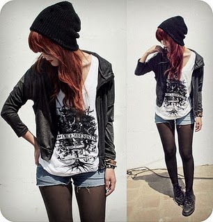
All of these poses are 'quirky' and different which is just whqat im looking for, and all of their clothing is typically 'unique'- though demin shorts and leather jackets seem to be a staple for the type of style my model should look like. I also like the hat as a prop as it is something different to what you would see in most magazines, aswell as the sunglasses- though they would hide my model's expression so would not nessicerily work.


The clothing used in these pictures are more feminine than the one's before- but with an edge, just like I would like my artist to look. So I wouold maybe use more floral patterned clothing or a skirt/dress with different types and styles of accessories and jewellry to give it something different.
Draft Front Cover- Improved.

I have not changed much, but I thought the splashes of colour looked abit too random- and therefore unprofessional- so rearranged them and also removed the flower as it was not appropriate for a multi-gender magazine- soemthing I would like mine to be.
Draft Double Page Spread 2 -New.

I re-did my double page spread as I did not think my first worked and looked professional. I first off decided with a simple layout of a picture filling one page and the article on the opposing page- simple but effective. I also wanted to add less colour- so used a splash of my colour scheme to make it creative and interesting, without being boring and too plain. I also changed my picture to black and white and higher contrast so the photo does not deviate from my colour scheme- and also looks more striking and eye-catching. I still used a handwritten-like font so as to keep and give a creative and unique edge to the simpler layout.
Friday, 4 February 2011
Draft Double Page Spread
 This is my first double page draft of mine, and I like the way it greatly inkeeps with my colour scheme- however I find the pink too overwhelming in its amount. The creative fonts at the top help keep it individual and different and so does the 'quirky' pose- two things I would like to keep in my final draft. Though aswell as being too strong a colour, I do not like that my article is not in coloums- it defies a very important magazine technique and makes the page look messy and out of order- and sloso doesn't easily shopw where the page splits.
Draft Article - a lot of soul, a lot of passion and hell of a lot of fun.
At six o’clock in the morning the last thing you would normally expect to see when you walk into a coffee shop is a bright-eyed nineteen-year-old waiting eagerly for you to arrive. But alas in the heart of the bustle of London, the teenage singer/songwriter River Valentine is sitting casually sipping a cappuccino, blissfully unaware of the attention she seems to be getting. After all, she’s on the rise of fame since her latest song release, faith and order.
As we settle into our interview, River surprises me through her easy manner- something rather uncommon with many teenage celebrities I have encountered before- and graciously orders me a coffee of my own. As we discuss her growing fame she shy fully tells me that she honestly never expected this kind of reception to the industry, mostly due to her less-than-glamorous start in countryside pubs on karaoke night. ‘Like anyone, music is my passion, but doing it for a living is something I never even dreamed of as I knew to achieve it is so hard. I’m just so ecstatic that I’ve had the chance to play to so many people and share my words and lyrics’. And River has also been honoured, at a young age of nineteen, to headline many of this year’s biggest festivals- from Glastonbury to Reading. ‘I’m looking forward to the energy that they’ll bring, bigger crowds give me more energy onstage and of course, seeing the other bands and enjoying the festivals themselves will be out of this world!’ exclaimed the singer, ‘Plus I’ve heard I’ll be playing near a few of my own favourite artists, which will be phenomenal.’
And like her album name [something soulful, nothing shallow] states, River tries to keep her herself as real as possible through both her music and her life. ‘I try to keep myself grounded and not get too big-headed, though it can be quite difficult when a whole new world has been opened up to you. Though you’ll never see my falling around drunk and flashing my knickers; that’s just not my style!’ And true to her word, as of yet none of River’s dirty secrets have hit the newspapers- ‘They don’t exist!’ the dark haired singer assured us, ‘I can’t think of anything I wouldn’t want to tell the world about my life so far- they can have me for who I am; a bit musical, a bit mad and very much loving how my life is right now!’
Tuesday, 1 February 2011
Draft Cover

I wanted to keep my model to one side so my article could go down one side and not make the page look too messy/busy, and i like how this worked as they fitted around her and made it look tied together. I only used a different sort of font for muy main articel- my double page spread- as I think it helps symbolise that it is the main attraction of the issue. I also wanted to incorporate my colour scheme in a creative way so by used just splahes of colour my cover would look interesting, although on this copy I feel I have too many splashes so would use less in the real thing, aswell as taking away the flower as it makes the magazine too gender specific. I used another smaller puicture for a lesser article to give the magazine more interesting things to read and look out and keep it from being boring.
Magazine Pitch Feedback
Many mentioned that they liked the magazine's name due to it's meaning and connection to music, and also that I plan on keeping the magazine quite simple with handwriting font making it more personal.
The use of the colour scheme brought up many comments, though going agazinst conventions adn using pick in a multi-gender audience is something risky but effective if it works well. They have said it also makes my magazine indiviual which is good, but that I have to be careful it still fits my genre- something I will now keep a close eye on.
Friday, 28 January 2011
Draft Contents Page

I liked encorporating my new colour scheme into this contents page, and think it worked well with just a splash of colour- especially running down one edge as this is ironic with the cmyk coulour palette as when magazine's go wreong, these colours appear down this side. I also liked the use of a textured background, to make the magazine look more professional and stand out instead of being boring and one toned. The use of black and white photo helps keep to my colour scheme in an artistic way and I used my orignal font for the title to tie into the front cover effectively.
CMYK colour model


The CMYK colour model is made of the four colours used in colour printing, and is also used to describe the printing process itself. CMYK refers to the four inks used in some color printing: cyan, magenta, yellow, and black.
While making my mock contents page and double page spread I found my colour palette very hard to make look good, so I looked at the CMYK colour palette used in printing. Using these colours would add an ironic edge to my magazine as these colours only normally are seen if the magazine is printed wrongly, so using them would make my magazine edgy and different.
Tuesday, 25 January 2011
New Mock Covers

I like this cover as the dark clothing works well with the grey colour I am using as my background. I also like this font much more than the one before as it's simple but interesting aswell instead of just simple and boring. The pose on this cover also works as it is differnet and unique, though I think a pair of chunky headphones would not only make it more interesting, but also add a musical side to the cover. One fault of this pose is that she is looking down, whereas in a real one to keep it looking professional I would have her looking towards the camera- at it or in the general direction.

This cover works as she is looking at the camera, plus the pose is different and quirky. I don't very much like the clothing used, as the darker palette works much better with the colour scheme.

This pose is incredibly different to other magazines, which makes it unique but may also be too risky. This photo is more appropriate for inside the magazine as her body is turned away from the camera and so is her face. The necklace as a prop does look effective at making the photo interesting, along with the dark clothes working with the colour scheme.
Subscribe to:
Posts (Atom)